
Six Memorable Color Palettes from Real Interior Design Projects
Here are six real projects that prove unexpected color combinations create unforgettable interiors.
By Stacy Markow
Design by Artbuckle & Co.
Design by Kate Thacker Home
Design by Ashley Marcella Designs
Great interiors aren't remembered because they're safe.
They're remembered because they make you feel something.
Color is often what creates that emotional response. A lavender clawfoot tub. Deep teal tile against warm copper. Forest green paired with caramel leather.
The most memorable interiors rarely rely on one beautiful color, they rely on the relationship between several.
As an interior photographer, I spend my days looking at professionally designed homes, hotels, restaurants, and commercial spaces. Every so often a project stops me in my tracks, not because it's trendy, but because the color palette feels completely unexpected while somehow making perfect sense.
These are six of those projects.
Why Color Combos Matter in Design and Photography
Color does more than make a room pretty. It changes how people feel when they walk into a space. It tells stories without words.
Bold color pairings create instant mood. A deep forest green with warm coral makes a room feel cozy but alive. Dusty pink with charcoal gray feels modern and soft at the same time.
Your best work needs to photograph well. Social media drives new business, and press coverage gets you noticed. Bad photos kill even the most stunning spaces, and colors that look amazing to the human eye can fall flat on camera. They might blend together under certain lights, or they might look completely different than what you planned.
The right color combos solve both problems. They create rooms people love to live in AND spaces that photograph like a dream.
Six Bold Color Pairings That Just Work
Bold colors work because they break the expectation pattern.
Most people play it safe with color. They stick to what they know works. Beige with white. Gray with cream. Navy with gold.
When you pair unexpected colors, you create surprise, and that unexpectedness is what makes people pay attention. It’s the difference between “wow that’s a nice room” and “who designed this?”
Bold doesn't mean random. The best color combos follow basic color theory rules that make them feel right together.
These pairings might sound risky on paper, and they create spaces with serious wow factor. Each combo includes Pantone color codes so you can reference it to find similar shades.
Organic Modern Meets Vintage
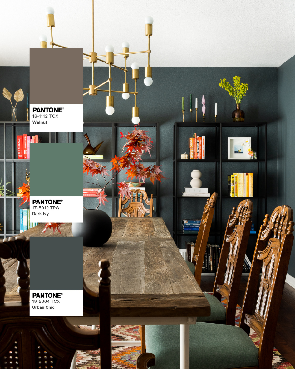
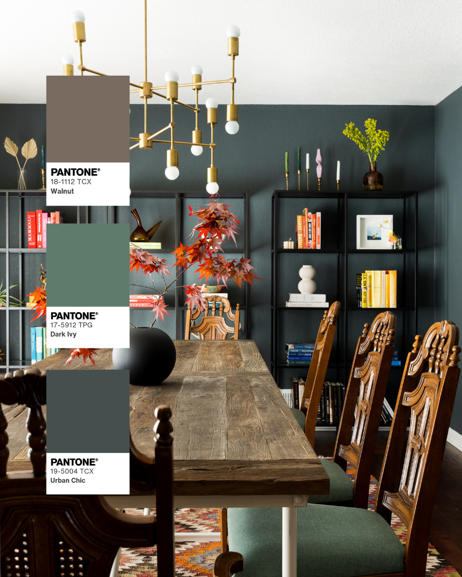
Walnut • Dark Ivy • Urban Chic
Design by Jordan Madison
Why it Works
The warmth of walnut immediately softens the coolness of slate blue while dark ivy introduces richness without overpowering the palette.
Where I'd Use It
Living rooms, libraries, dining rooms, boutique hospitality.
Photography Insight
Deep greens absorb light quickly, making exposure consistency especially important.
Resort-Inspired Contrast
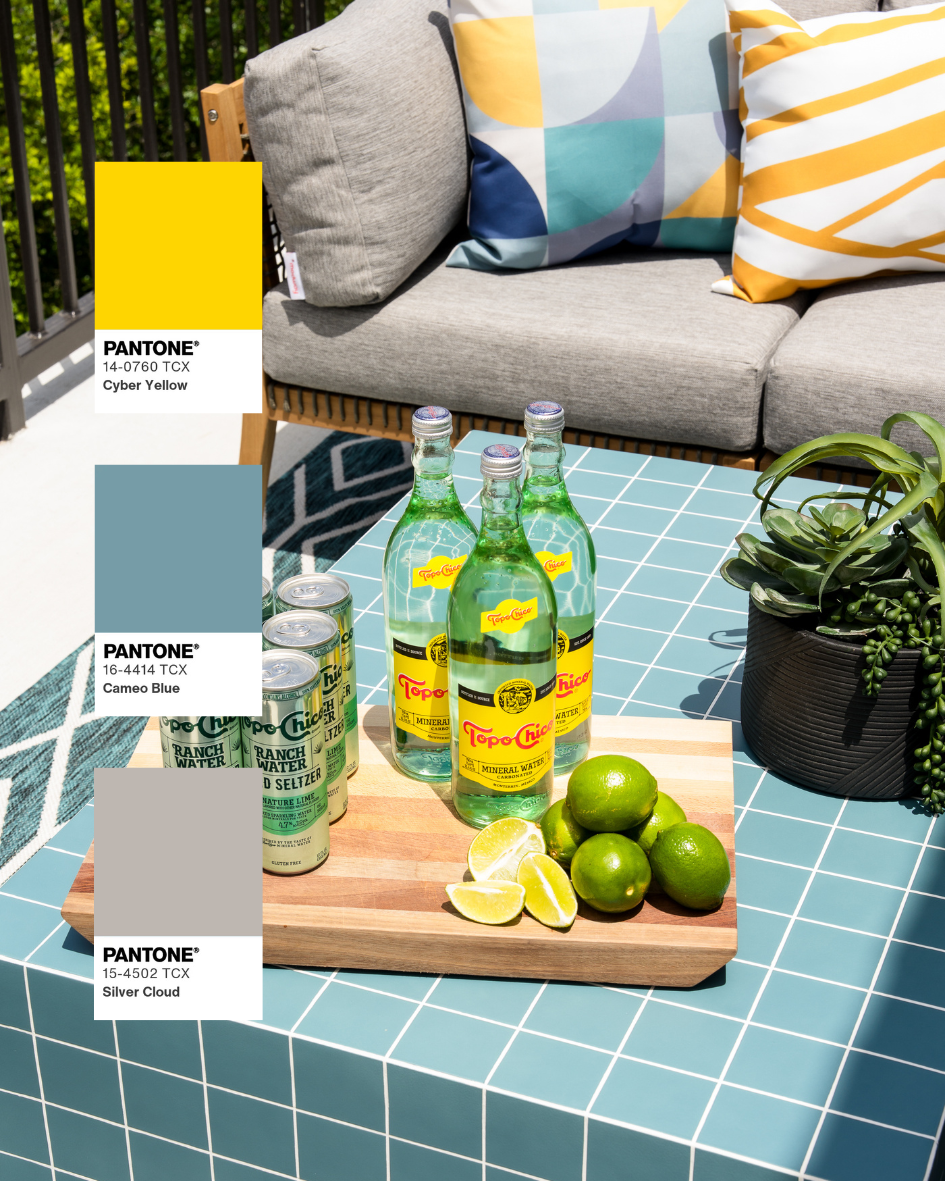
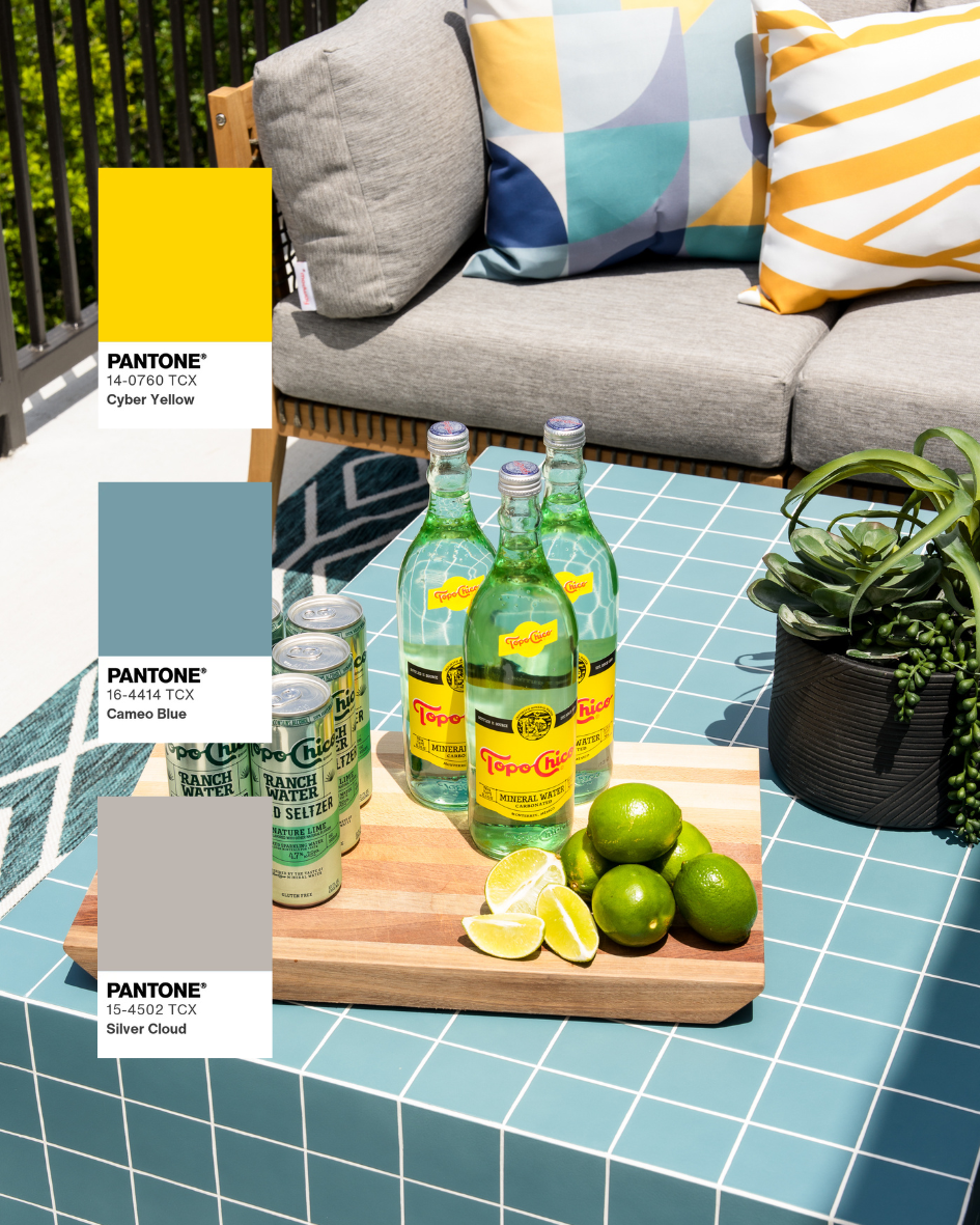
Cameo Blue • Cyber Yellow • Silver Cloud
Design by Artbuckle & Co.
Why It Works
This palette proves that high contrast doesn't have to feel loud. The soft blue establishes a relaxed, coastal foundation while vibrant yellow introduces moments of optimism and energy. Silver gray acts as the quiet mediator, keeping the palette feeling sophisticated instead of playful.
The result is fresh, graphic, and unmistakably joyful.
Where I'd Use It
Perfect for outdoor living spaces, pool houses, patios, children's spaces, hospitality lounges, and vacation homes where you want the space to feel bright, welcoming, and full of personality.
Photography Insight
Bright yellows can easily become overexposed while blues lose saturation. Balanced lighting preserves the richness of both colors so neither overwhelms the other.
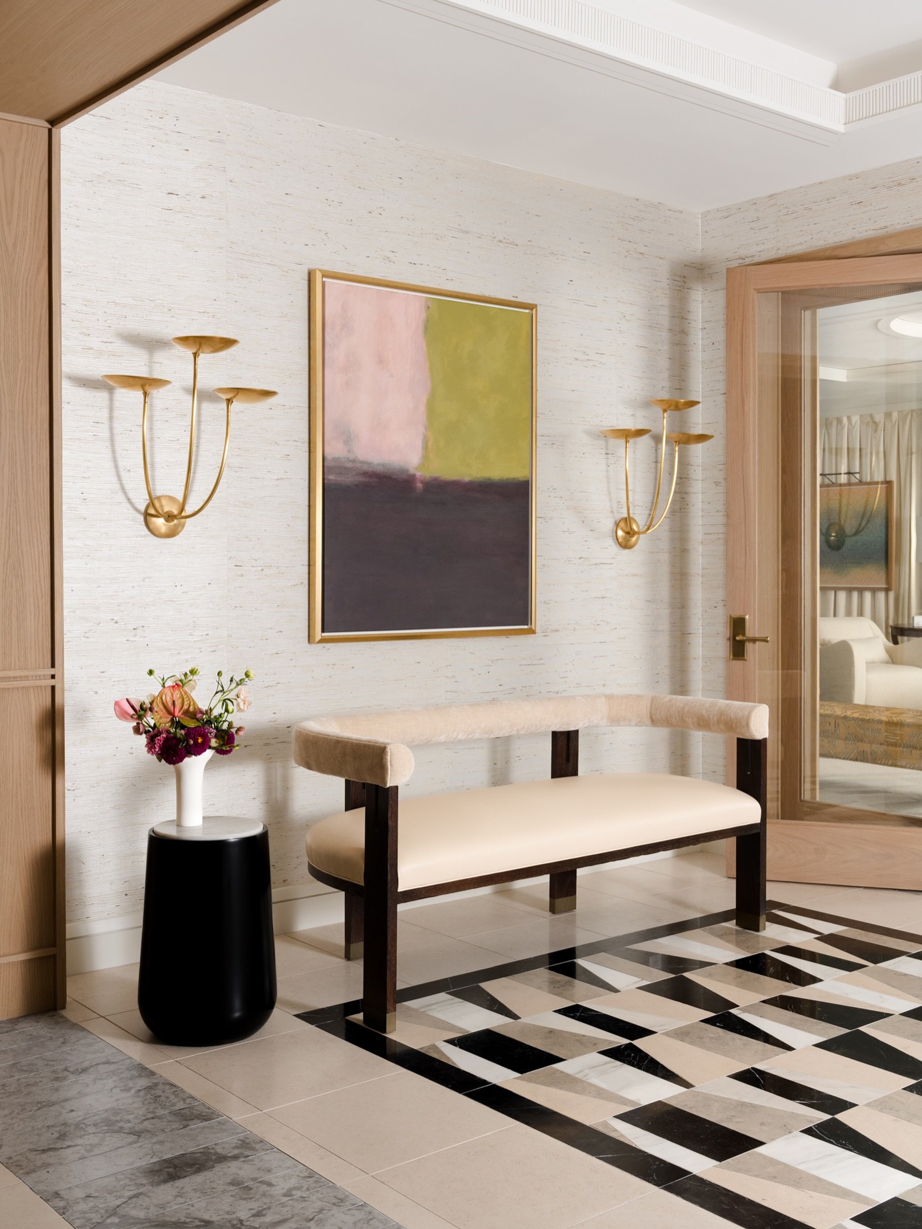
Modern Glamour
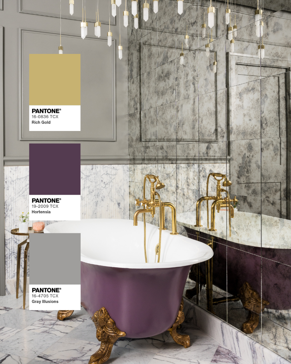
Hortensia • Rich Gold • Gray Illusions
Design by Kate Thacker Home
Why It Works
Lavender isn't typically the first color people associate with luxury, yet paired with warm gold and soft gray it immediately feels elevated. The purple introduces personality and elegance, while metallic finishes catch the light and create visual depth. Gray provides just enough restraint to keep the palette from feeling overly ornate.
It's dramatic without becoming overwhelming.
Where I'd Use It
Bathrooms, dressing rooms, powder rooms, boutique hospitality spaces, statement kitchens, or anywhere a single unforgettable feature deserves to become the focal point.
Photography Insight
Reflective finishes like polished brass and marble require careful lighting to preserve detail without creating distracting glare. Controlled lighting allows both the finishes and the color palette to shine equally.
Maximalism with Balance
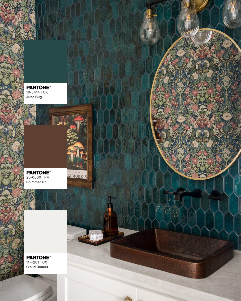
June Bug • Shimmer On • Cloud Dancer
Design by Ashley Marcella Designs
Why It Works
Deep teal instantly commands attention, but pairing it with warm copper and crisp white keeps the room feeling intentional rather than heavy. The white creates breathing room while copper softens the coolness of the teal through warmth and reflection.
It's bold, playful, and layered without feeling chaotic.
Where I'd Use It
Powder rooms, wet bars, dining rooms, boutique restaurants, creative offices, and anywhere you're designing a memorable "wow" moment.
Photography Insight
Dark saturated tile absorbs significantly more light than surrounding finishes. Carefully controlled lighting maintains texture while preventing shadows from swallowing important design details.
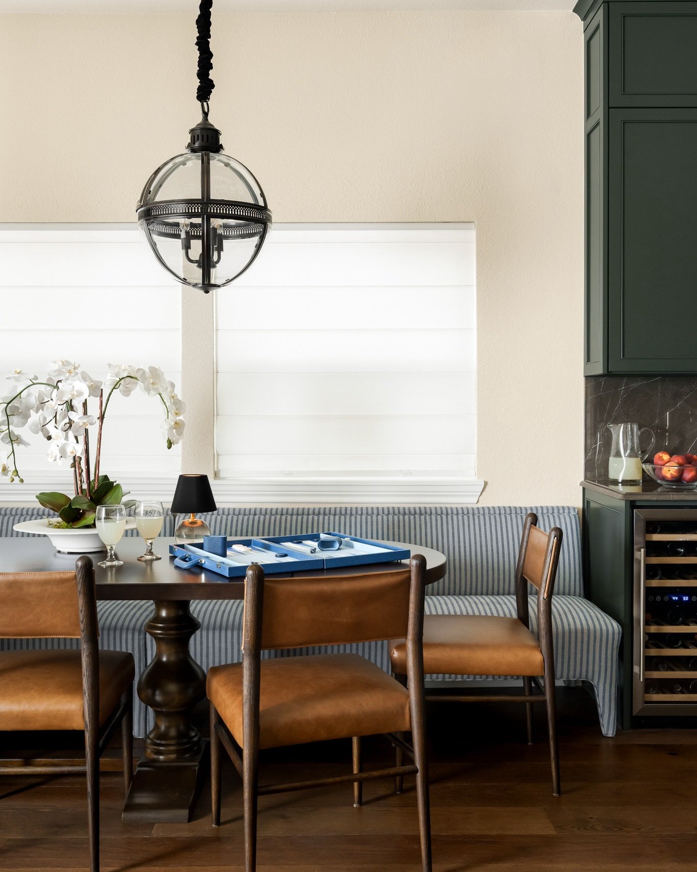
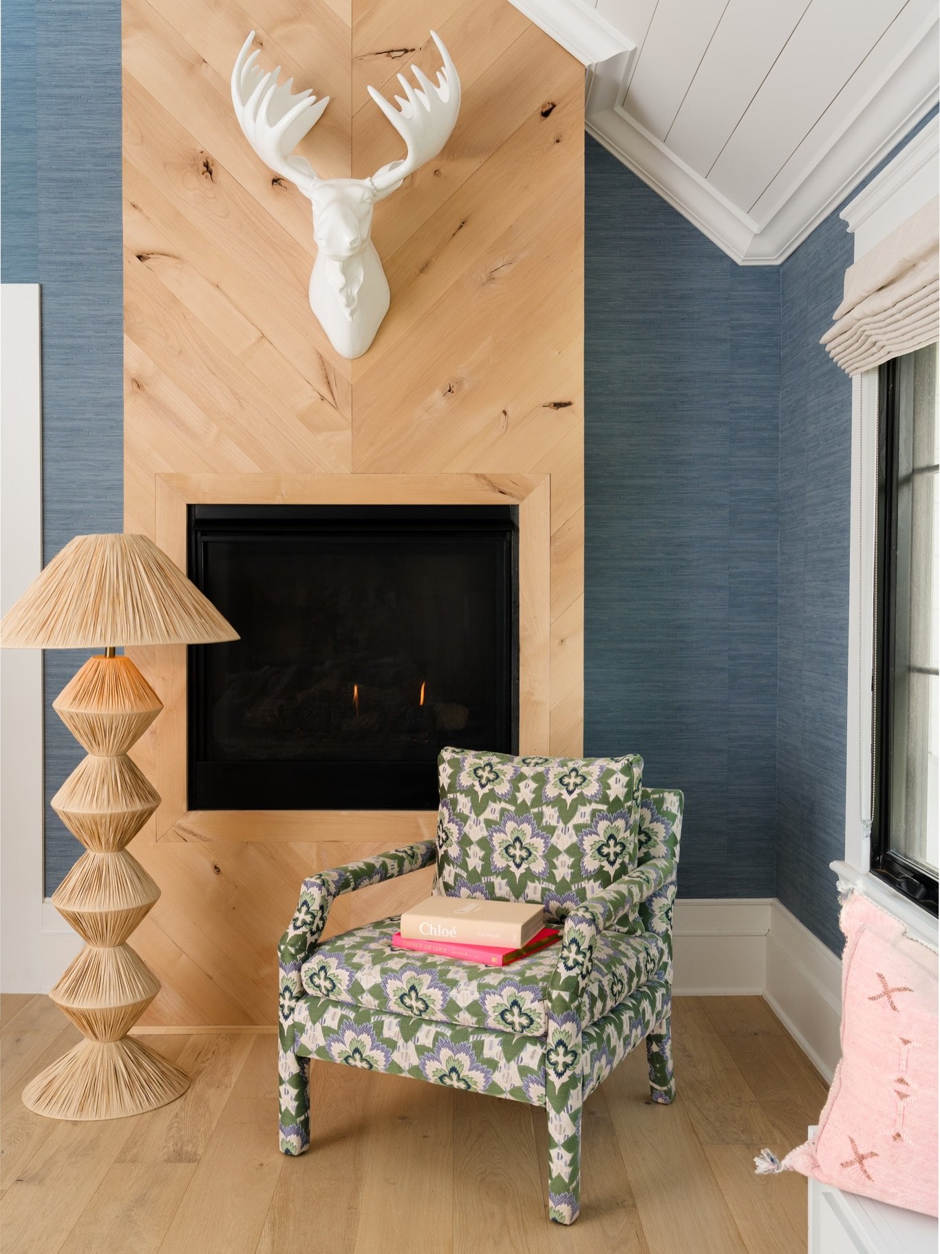
Organic Modern Retreat
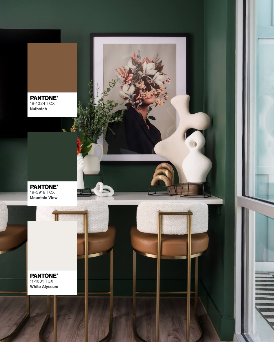
Nuthatch • Mountain View • White Alyssum
Design by Artbuckle & Co.
Why It Works
Warm caramel, creamy white, and rich forest green create one of the most timeless combinations in interior design. Earthy materials establish warmth while green introduces life and softness. White prevents the palette from feeling too heavy, giving every finish room to breathe.
The result feels collected, calming, and effortlessly sophisticated.
Where I'd Use It
Living rooms, reading nooks, primary bedrooms, restaurants, boutique hotels, and nearly any residential space where comfort and warmth are the priority.
Photography Insight
Natural materials reveal their character through subtle texture rather than bold contrast. Soft, directional lighting preserves those textures while accurately reproducing the warmth of wood and upholstery.
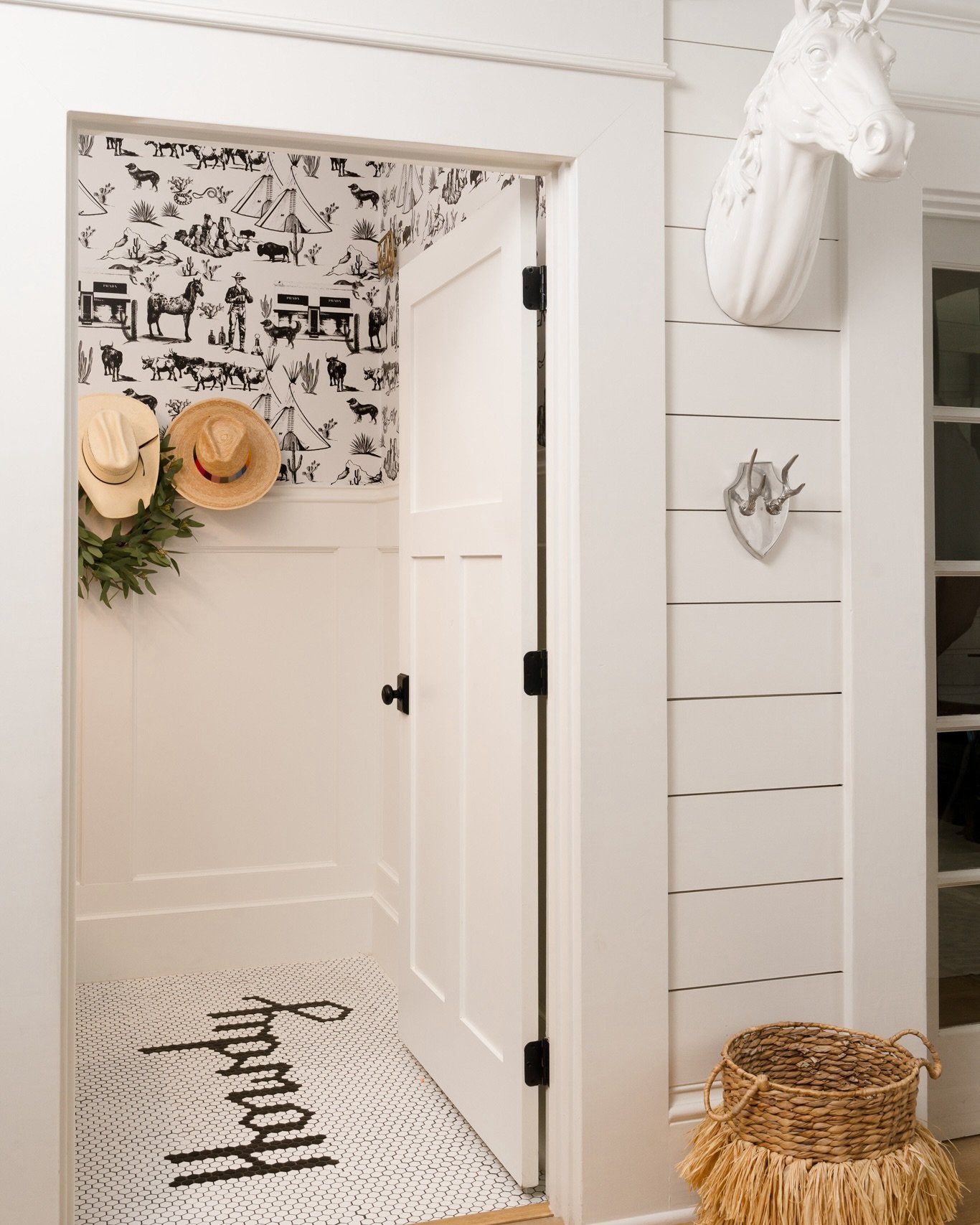
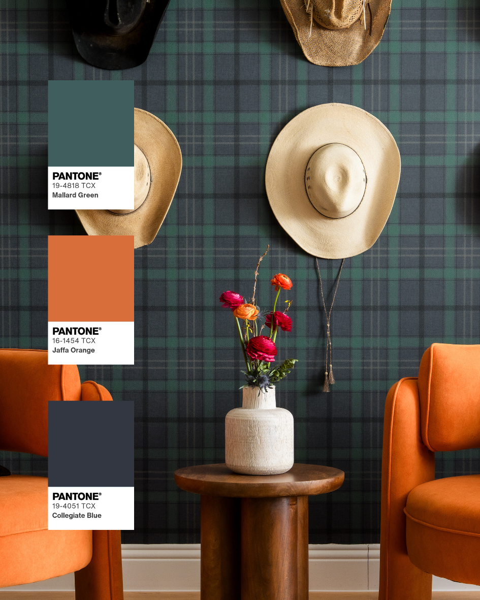
Modern Western
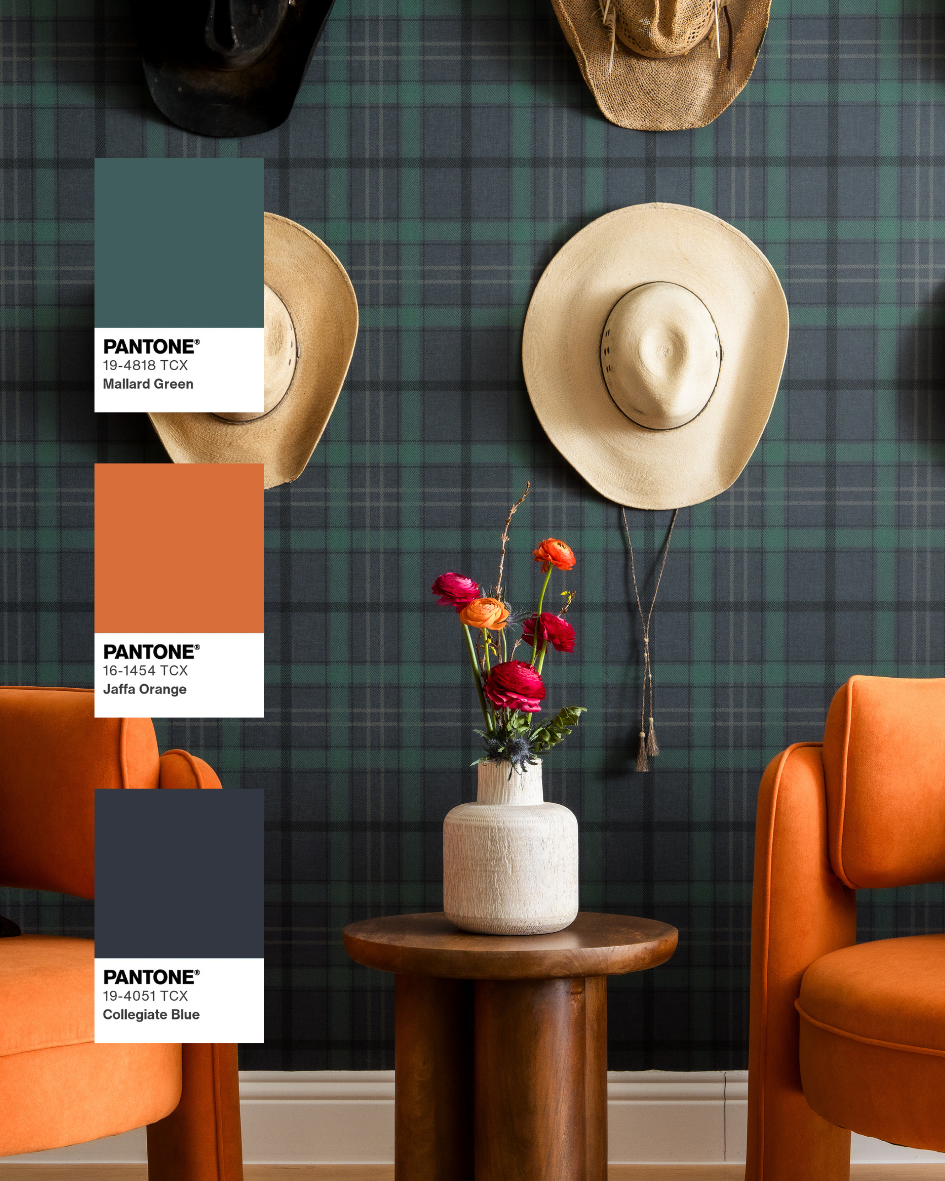
Mallard Green • Jaffa Orange • Collegiate Blue

Design by Britney Ratto
Why It Works
This palette feels rooted in tradition while remaining completely current. Deep green establishes a grounded foundation, burnt orange injects warmth and personality, and navy introduces richness without competing for attention. Together they create a layered palette that feels collected instead of themed.
It's bold, masculine, and full of character.
Where I'd Use It
Libraries, ranch homes, mountain retreats, hunting lodges, hospitality lounges, home bars, and spaces inspired by modern Western design.
Photography Insight
Multiple saturated colors competing within the same frame require careful balance. Consistent color reproduction ensures each hue maintains its intended role without overpowering the composition.
Photographing Design as It Was Intended
Every color decision in a professionally designed space is intentional.
The goal of photography isn't simply to document the room, it's to faithfully preserve those decisions. Saturated colors are especially sensitive to changing light, and without careful control they can appear dramatically different than what the designer specified.
That's why I rely on controlled lighting throughout every session. It allows me to reproduce the richness, depth, and accuracy of each material and finish so the photographs reflect the design, not the changing conditions outside the window.
Beyond the Color Palette
A memorable color palette deserves to be documented with the same level of intention that went into designing it.
Whether your project leans toward rich jewel tones, warm earth tones, or subtle pops of unexpected color, thoughtful photography preserves the relationships between materials, finishes, and light exactly as they were intended. Those photographs become the images that tell the story of your work; on your website, in publications, across social media, and in future client presentations.
The most distinctive projects are often the ones people remember. Make sure the photography allows them to be remembered for the right reasons.
Frequently Asked Questions
Will bold colors photograph well?
Absolutely; but color accuracy depends on thoughtful lighting and careful post-production. Saturated colors can easily shift under changing light, which is why a controlled lighting approach is so important.
What if my project is mostly neutral with just a few bold accents?
Those accents often become the focal point of the room. A single colorful piece of furniture, statement stone, or wallpaper can have just as much visual impact as an entire colorful interior when photographed intentionally.
Does the time of day matter?
Yes. Natural light changes constantly throughout the day and affects how colors appear. Every project is planned around the available light, and when needed, controlled lighting ensures finishes and colors remain consistent throughout the session.
Inspired to Design with Color?
The best interiors aren't memorable because they follow trends, they're memorable because they have a point of view.
If you're creating a project with bold materials, expressive color, or layered textures, I'd love to help document it with photography that preserves every design decision as you intended it to be seen.
Follow Along on Instagram
Recent projects, behind-the-scenes moments, and a closer look at the spaces, details, and designers I have the opportunity to photograph.
Inspired to Design with Color?
The most memorable interiors aren't defined by trends, they're defined by thoughtful decisions that feel uniquely their own. Whether your next project embraces rich jewel tones, warm earth-inspired palettes, or an unexpected combination that breaks the rules, those choices deserve to be photographed with the same level of care that went into designing them.
If you're planning a project where color, materials, and craftsmanship take center stage, I'd love to help create imagery that preserves every detail with accuracy and intention.

Experience and creativity are key for these interior designers in Dallas. Find great interior designers for your home or office today.