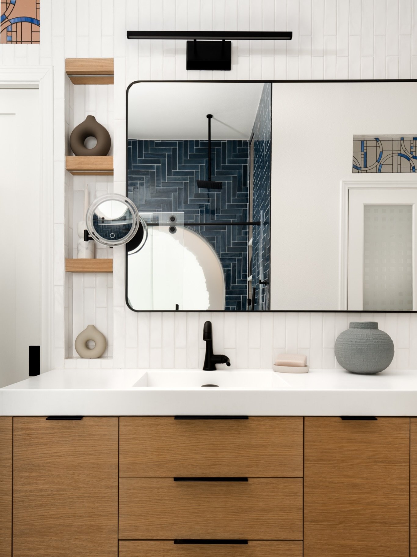
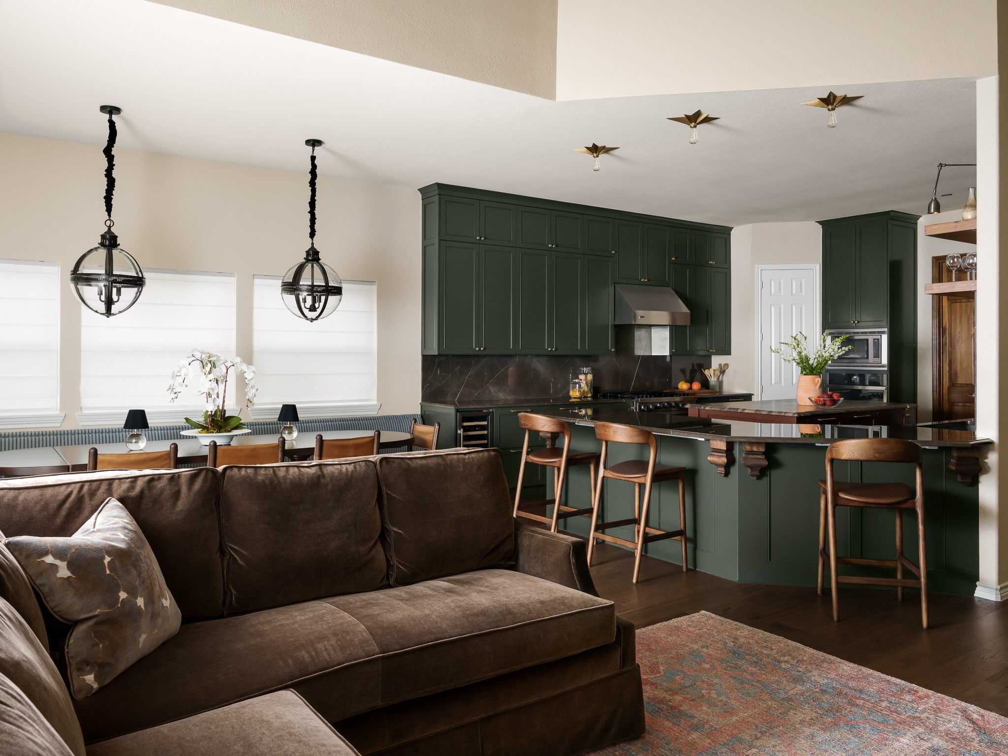
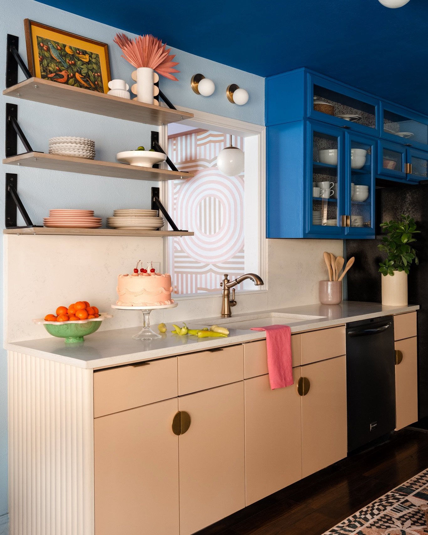
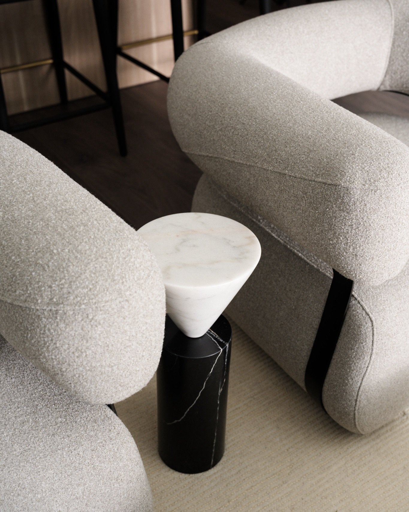
Small adjustments photographers and designers can make on shoot day to create cleaner, more intentional images
By Stacy Markow
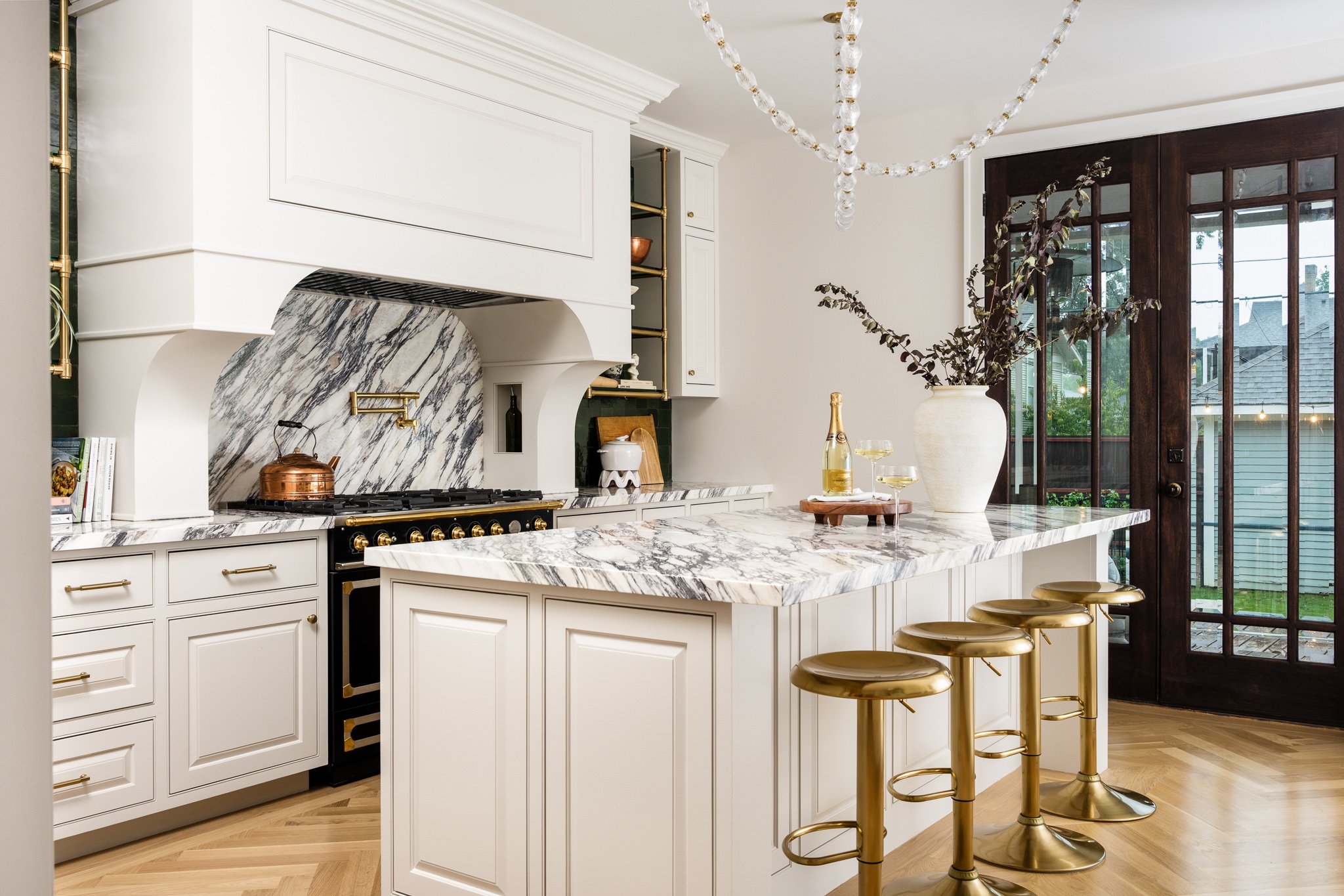
A beautifully designed room and a beautifully photographed room aren’t always exactly the same thing.
When you’re standing inside a space, your eye naturally moves around it. You experience the architecture, furniture, materials, color, and details individually and as a whole. But the moment we put a camera in front of that same room, everything gets compressed into a single frame.
Suddenly, a pillow feels too prominent. A chair interrupts an important sightline. A branch disappears into a piece of artwork. The bedding you thought looked perfectly fine has a wrinkle that becomes impossible to ignore.
These aren’t problems with the design. They’re simply part of translating a three-dimensional space into a two-dimensional photograph.
And often, the difference between a good photograph and a beautifully resolved one comes down to a handful of very small adjustments.
Why Rooms Look Different Through a Camera
One of the most important parts of photographing interiors is learning to see the room as the camera sees it.
Objects that feel completely separate when you’re standing in a space can overlap once they're compressed into a photograph. Furniture can suddenly feel crowded. Accessories that seemed balanced in person may compete for attention within the frame.
This is why I don't consider the room completely styled simply because we're ready to begin photographing it.
Once I've established the composition and we're looking at the image through the camera, we can make small refinements specifically for that photograph.
Sometimes that means moving a chair a few inches. Sometimes it means removing something entirely.
The goal isn't to redesign the room for photography. It's to make sure the photograph communicates the design as clearly as possible.
Edit Before You Add
When something feels off in a photograph, the instinct is often to add another styling element.
Another pillow. Another accessory. Another stack of books.
But one of the first things I look at is whether we actually need to remove something.
Interior photographs contain an enormous amount of visual information. Architecture, furniture, artwork, lighting, textiles, accessories, and materials are all competing for space within a relatively small frame.
Removing one object can sometimes give everything else more room to breathe.
This is especially true with coffee tables, kitchen counters, consoles, and open shelving. Styling doesn't need to disappear, but every object should contribute something to the composition.
Adjust Furniture for the Composition
Furniture placement that works beautifully for everyday living doesn't always create the strongest photograph.
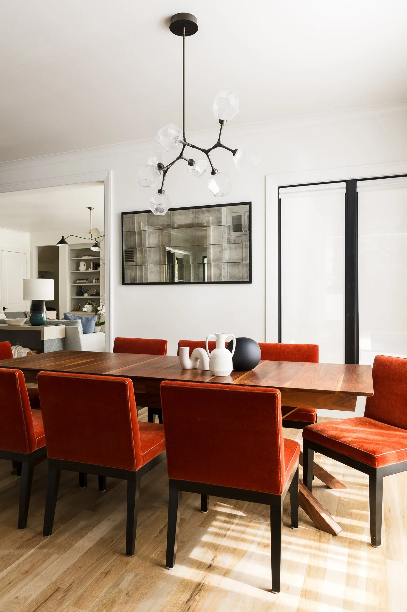
A chair may need to rotate slightly so we can see more of its shape. A coffee table might move a few inches to create better separation between pieces. A dining chair may need to shift so it doesn't visually merge with the chair behind it.
These changes are usually incredibly subtle.
We're not rearranging the room. We're creating enough visual separation for the viewer to understand the furniture, architecture, and relationships between different elements of the design.
A few inches can make a surprising difference.
Pay Attention to Sightlines
This is one of those details that's difficult to notice until you're looking through a camera.
Because a photograph compresses the room, objects that aren't actually close together can suddenly appear to intersect.
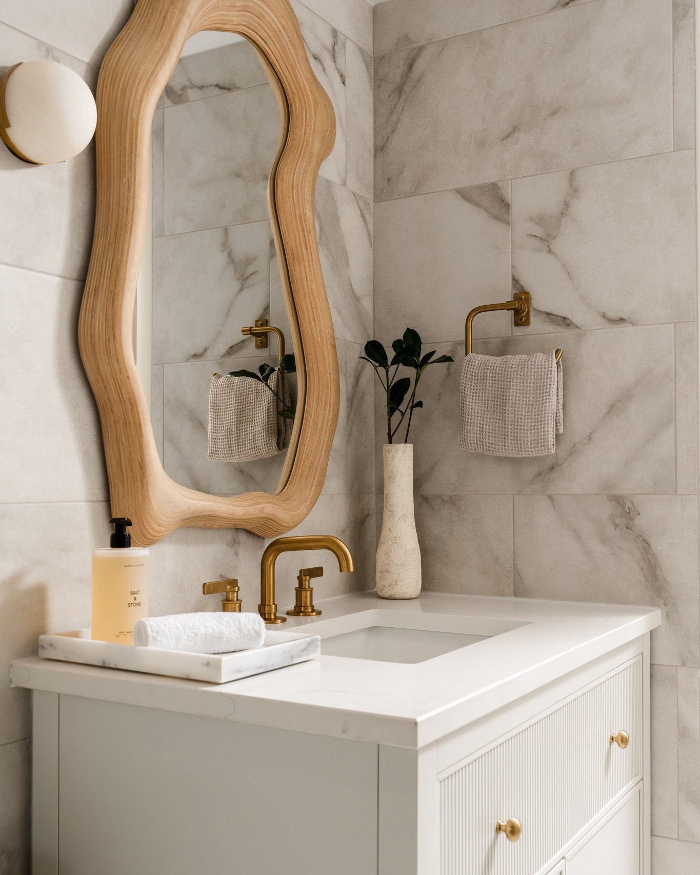
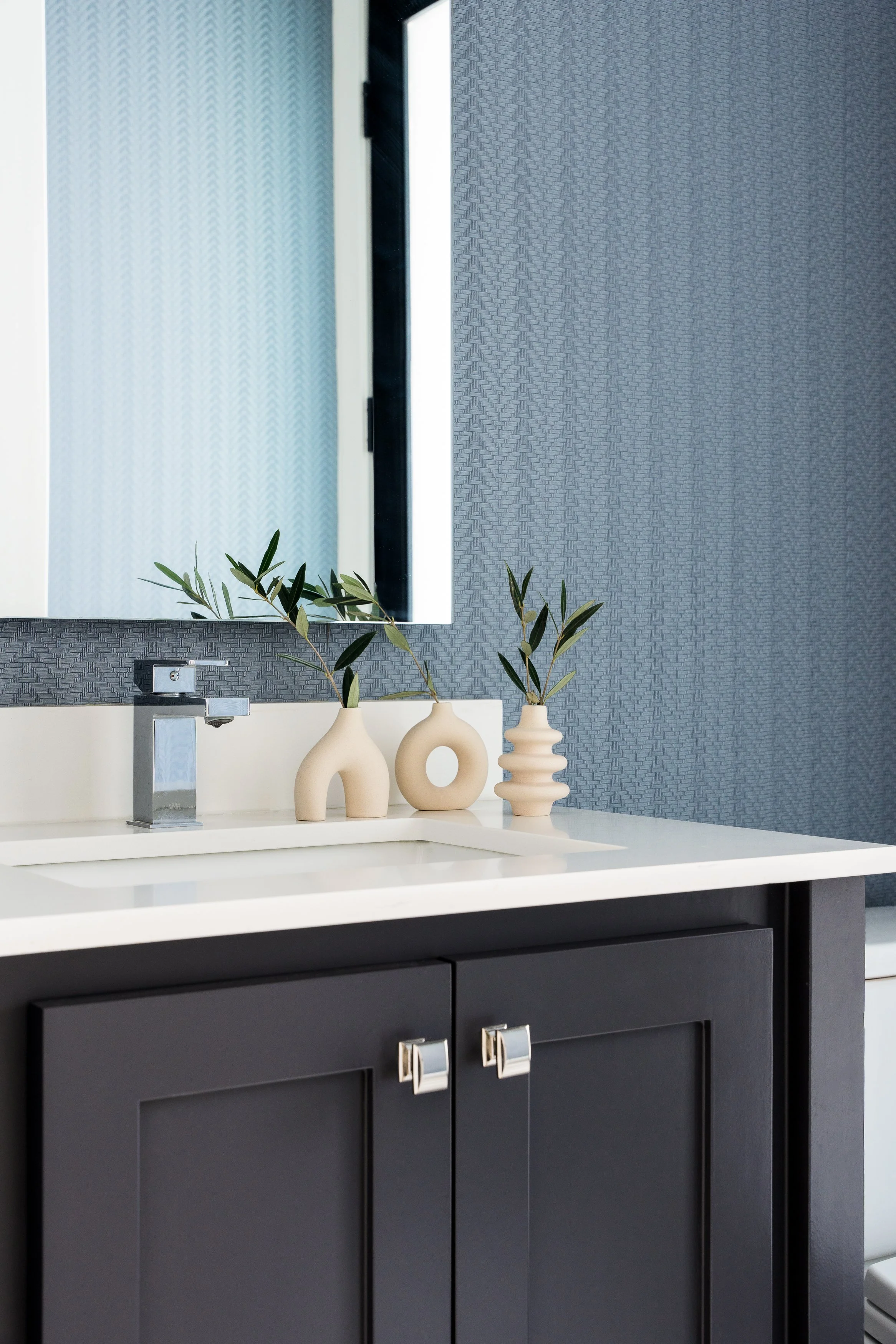
A branch might run directly through a piece of artwork. The edge of a chair might cut through a console. A lamp could merge into a doorway behind it. A decorative object might disappear against something of a similar color or shape.
Once the composition is established, I look carefully around the entire frame for these intersections.
Sometimes moving an accessory an inch to the left is all it takes.
These tiny adjustments may seem insignificant on set, but collectively they help create photographs that feel quieter, cleaner, and more intentional.
Give Textiles a Final Look
Textiles are particularly unforgiving in photographs.
Wrinkled bedding, uneven drapery, twisted rug edges, sagging pillows, and throws that feel slightly too arranged can quickly become distracting.
A garment steamer is one of the most useful things to have available on shoot day, particularly when we're photographing bedrooms.
Bedding deserves extra attention because the bed occupies so much visual space within a bedroom photograph. If your client's existing bedding isn't representative of your work or the way you want the room photographed, bringing alternative bedding, pillows, or a throw can completely change the final composition.
The goal isn't necessarily perfection.
I still want fabrics to feel soft, dimensional, and lived in. We just don't want an unintended wrinkle becoming the thing your eye notices first.
Use Florals and Branches
Fresh florals and branches are wonderful tools for bringing movement, softness, and life into an interior photograph.
But more isn't always better.
I tend to think about florals in relation to the architecture and composition rather than simply using them to fill an empty surface.
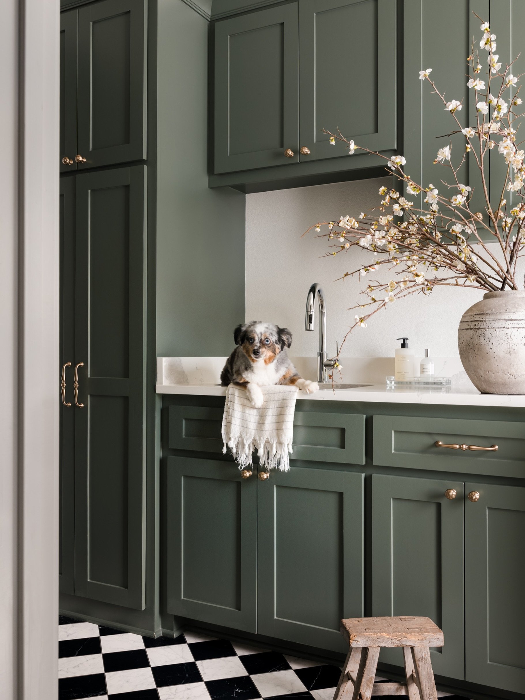
A sculptural branch can draw your eye upward and emphasize ceiling height. A smaller arrangement can provide color without competing with the rest of the room. Greenery can soften a space filled with hard architectural materials.
Scale matters, too.
An arrangement that looks beautiful when you're standing beside it can become surprisingly dominant in a photograph. Once the camera is in place, we can decide whether it needs to be taller, shorter, fuller, simpler, or moved somewhere else entirely.
If you're sourcing florals specifically for an upcoming shoot, I've also put together a guide to some of my favorite Dallas florists for interior designers.
Style Open Shelving Before Shoot Day
There are some styling decisions I don't recommend leaving until the last minute, and open shelving is one of them.
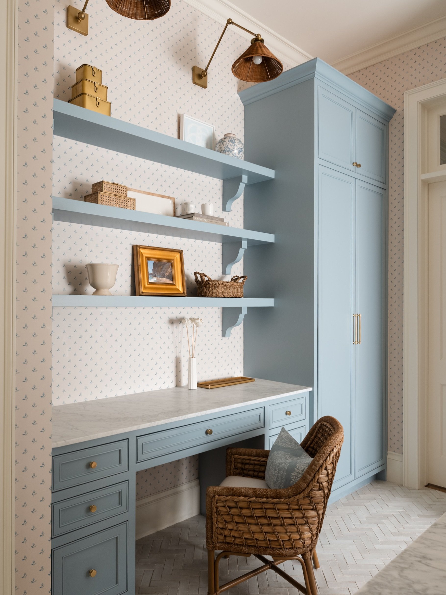
Bookshelves, built-ins, and large styled surfaces can take considerable time to get right.
If you're planning to photograph them, I recommend doing the majority of that styling before the photography day whenever possible.
Then, once we're looking at the shelves through the camera, we can make smaller adjustments based on the composition: removing an object that feels too heavy, turning a book, shifting a vase, or creating a little more negative space.
Shoot day should be about refinement, not starting from scratch.
Deal With TVs and Other Visual Distractions
Sometimes the biggest distraction in a beautifully designed room is something that simply needs to be there.
Televisions are probably the most common example.
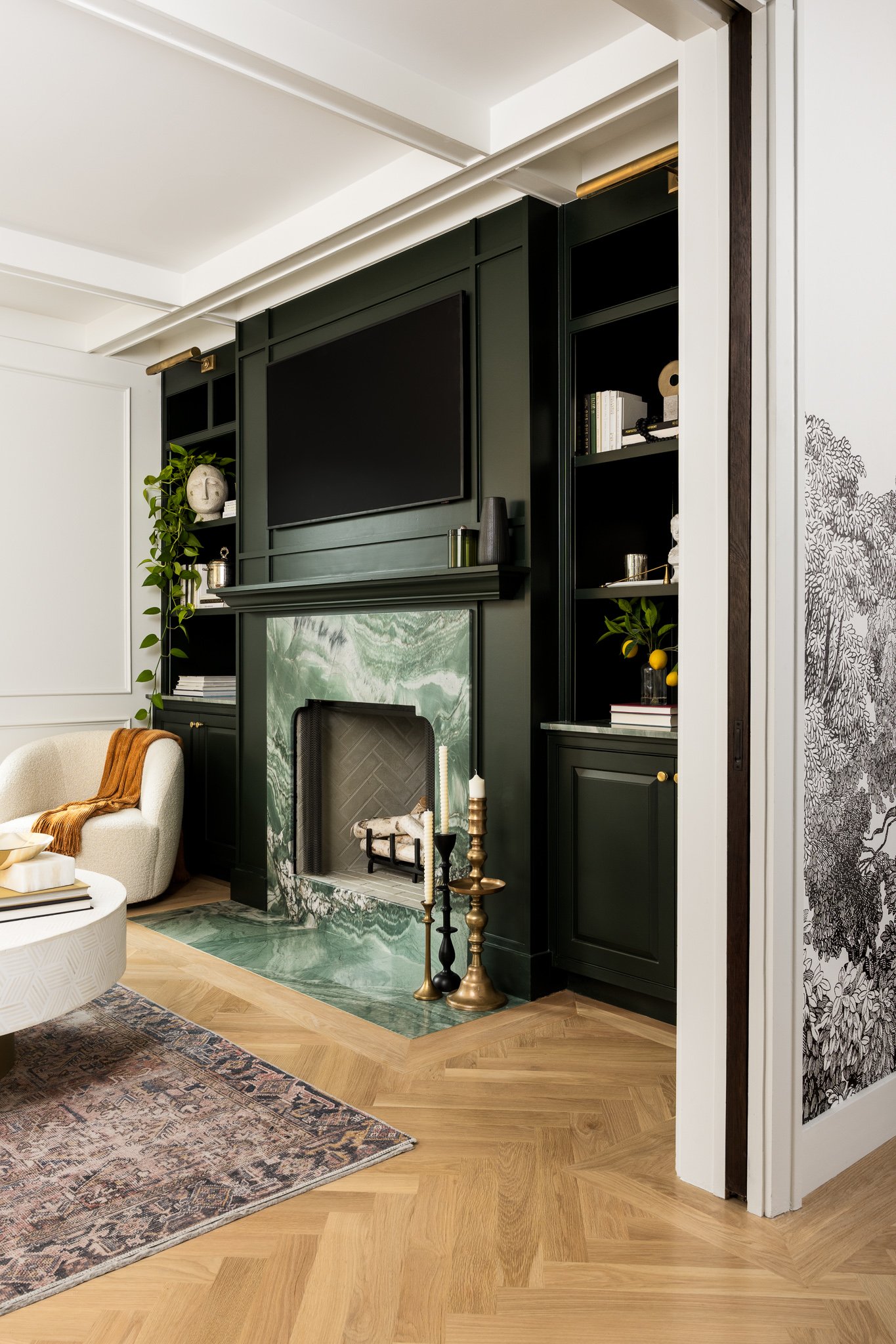
A large black rectangle can quickly become one of the strongest visual elements in an otherwise light or layered room, particularly when it's positioned prominently above a fireplace or console.
Depending on the room and composition, there are several ways we can approach it.
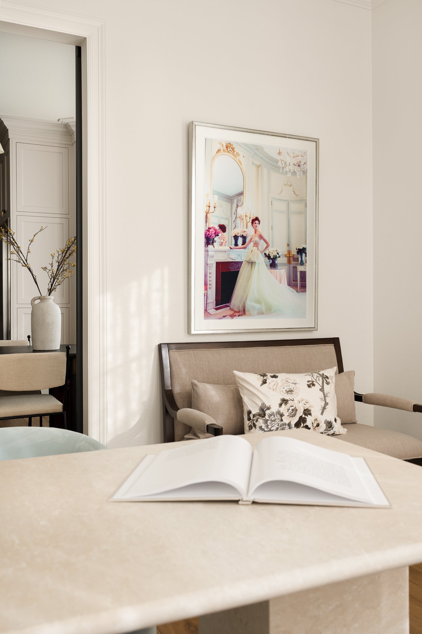
Sometimes the television works perfectly well within the photograph. Other times, we may be able to temporarily cover it with appropriately scaled artwork and address the remaining details during retouching.
The same principle applies to cords, thermostats, switches, vents, temporary electronics, and other elements that aren't important to the design story.
Not everything needs to disappear. The question is whether it's contributing to the photograph or unnecessarily pulling attention away from the design.
Do a Final Five-Minute Walkthrough
Before photographing a room, I like to look beyond the obvious styling and scan for all the tiny things that are incredibly easy to miss.
Are the lampshades straight?
Are dining chairs evenly positioned?
Are cabinet doors completely closed?
Are cords visible?
Are pillows sitting at slightly different heights?
Is artwork straight?
Are there remotes, tissue boxes, pet bowls, chargers, or everyday objects hiding somewhere in the frame?
None of these things are particularly important on their own.
But photography has a funny way of making tiny inconsistencies much more noticeable.
Taking five minutes to look closely before we begin can save time during both the photography session and retouching afterward.
The Best Styling Supports the Design
The goal of styling for interior photography isn't to make a room look artificially perfect.
It's to remove the things that distract from what you've created.
Your architecture, material selections, furniture, color palette, custom details, and design decisions should remain the story. Styling simply helps us guide the viewer through it.
That's also why I prefer to make many of these decisions once the camera is in position. We can evaluate the actual composition together and determine what the photograph needs rather than styling based on assumptions.
Sometimes we add something.
Sometimes we move something three inches.
And very often, we take something away.
Those small decisions are part of the collaborative process of turning a beautifully designed space into a photograph that communicates exactly what made the space special in the first place.
If you're preparing to photograph an upcoming interior design project, you can also read my Photoshoot Preparation for Interior Designers guide for a deeper look at what to consider before photography day.
And when you're ready to photograph your next project, I'd love to hear what you've created.
Thinking About Photographing Your Next Project?
Professional photography created for designers, architects and builders who value timeless imagery and thoughtful creative production.
Follow Along on Instagram
Recent projects, behind-the-scenes moments, and a closer look at the spaces, details, and designers I have the opportunity to photograph.