Paint Colors I Photograph Over and Over in Interior Design Projects
From the warm whites that quietly fill an entire home to the unexpected colors designers bring into cabinetry and smaller spaces, these are the paint colors that keep appearing in front of my camera
By Stacy Markow
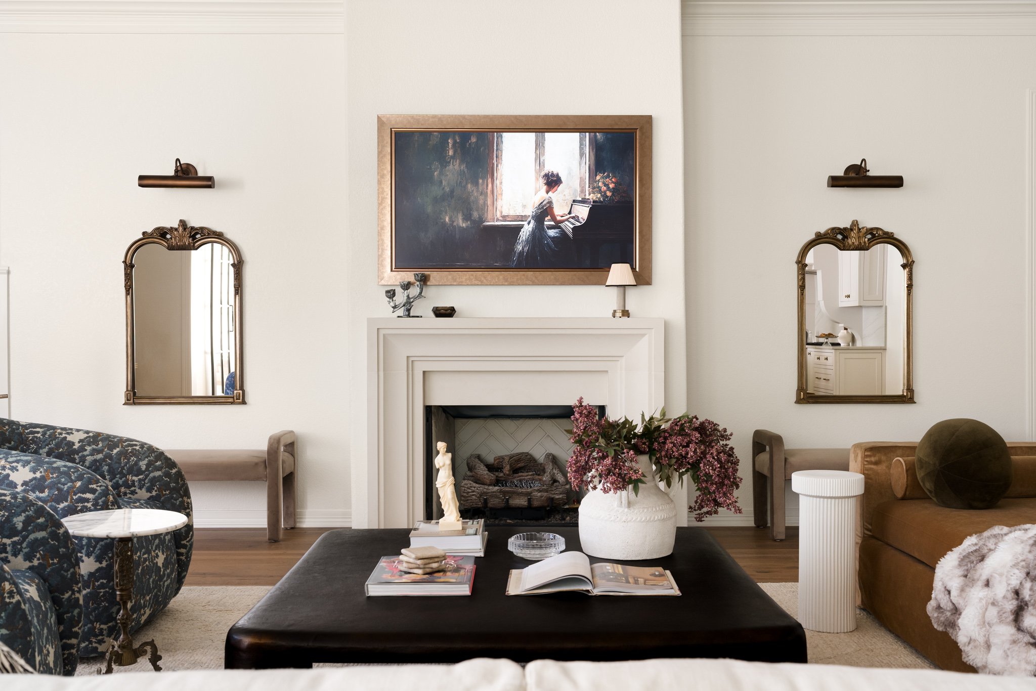
After photographing interiors for designers for several years, I've started to recognize certain paint colors before anyone tells me what they are.
Not because I'm secretly moonlighting as a color consultant. I'm definitely not. But when you spend your days looking closely at interiors, you start noticing the choices designers return to again and again.
And there are a few paint colors that seem to follow me from project to project.
Sherwin-Williams Alabaster. Accessible Beige. Greek Villa. Anonymous. I've photographed each of them more than once, sometimes on walls, sometimes on cabinetry, and sometimes used throughout much of a home.
But going back through my project notes revealed something else I found even more interesting.
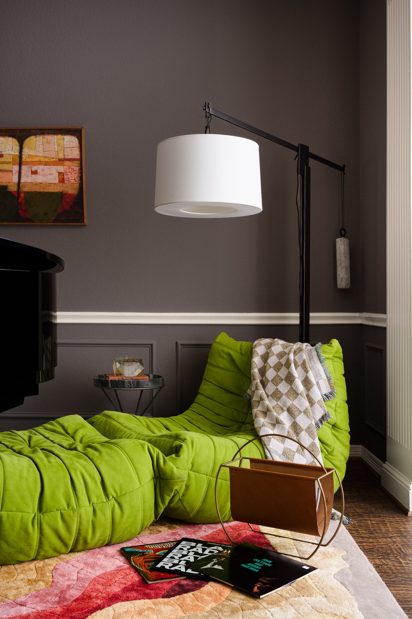
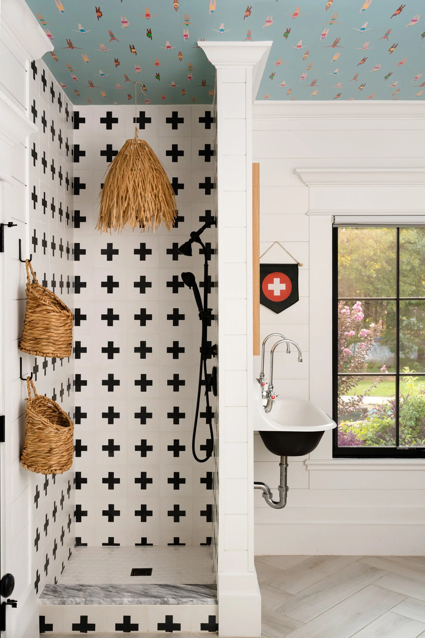
While the main living spaces I photograph tend to lean toward warm whites, creams, taupes, and nuanced neutrals, designers often use cabinetry, doors, bars, bathrooms, and smaller rooms as opportunities to introduce considerably more color.
Here are some of the paint colors I've encountered in the professionally designed homes I've photographed.
Sherwin-Williams Alabaster
SW 7008
Of all the paint colors in my project notes, Alabaster may be one of the most familiar.
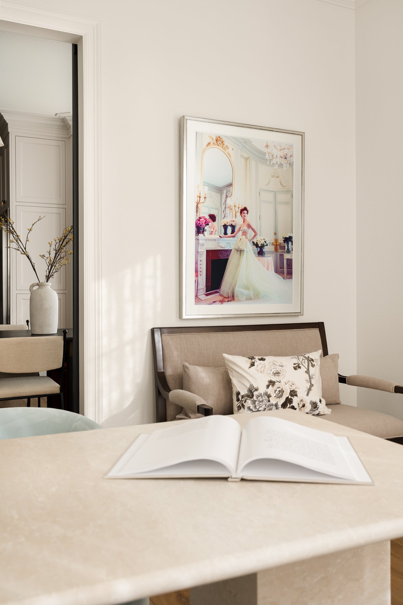
I've photographed it on walls, trim, doors, and cabinetry, including projects where it was carried throughout much of the home. It's the kind of warm white that can quietly support everything happening around it rather than becoming the thing you notice first.
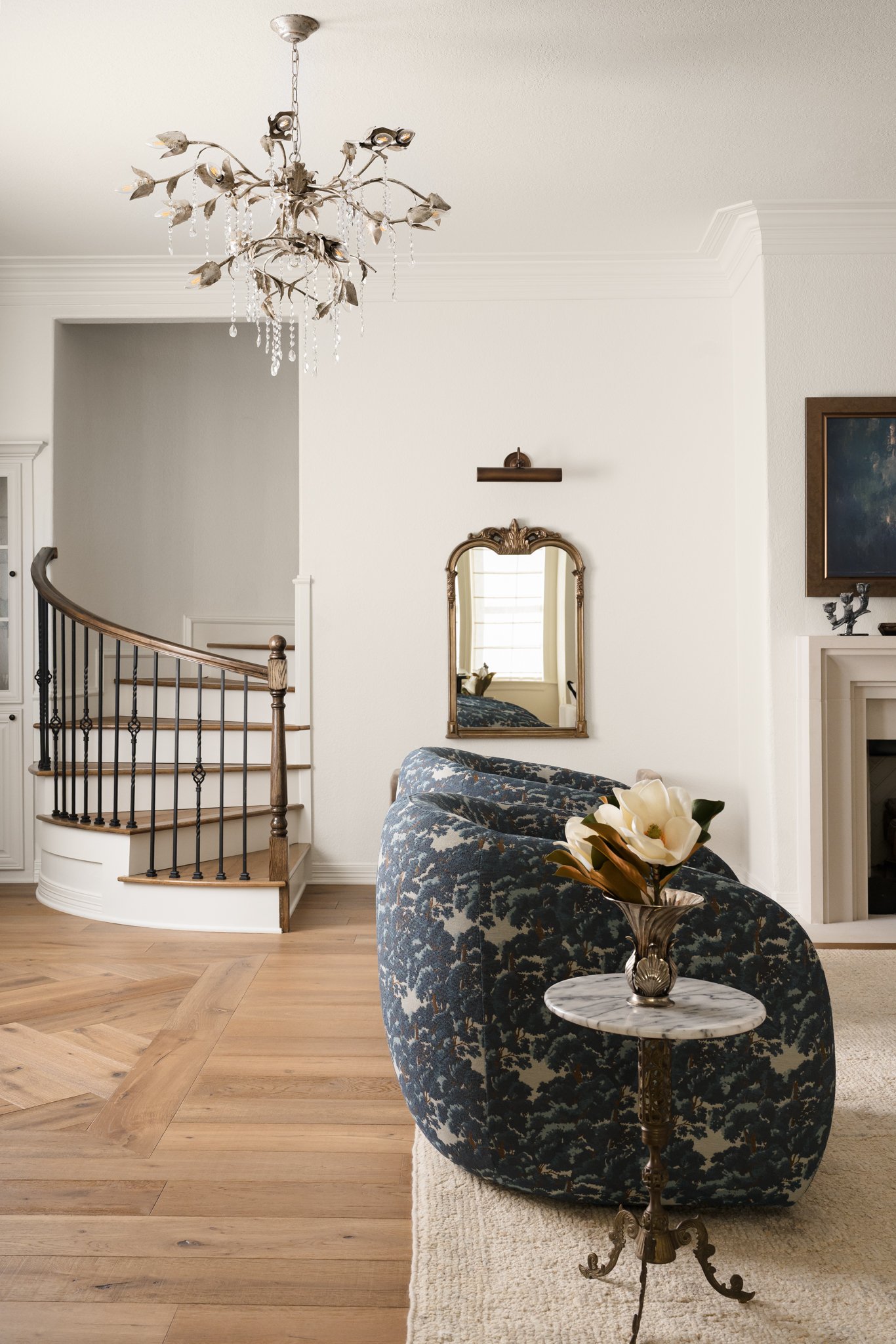
01 · WARM WHITE
Soft, warm and quietly versatile. A familiar backdrop in the designer spaces I photograph.
SHERWIN-WILLIAMS
ALABASTER · SW 7008
Sherwin-Williams Accessible Beige
SW 7036
Accessible Beige is another color that has appeared in more than one project I've photographed, but what I find interesting is how differently designers have used it.
I've seen it as a wall color, on kitchen cabinetry, and even carried onto architectural details like a barn door. Depending on the surrounding materials and light, it can read quite differently from one room to another.
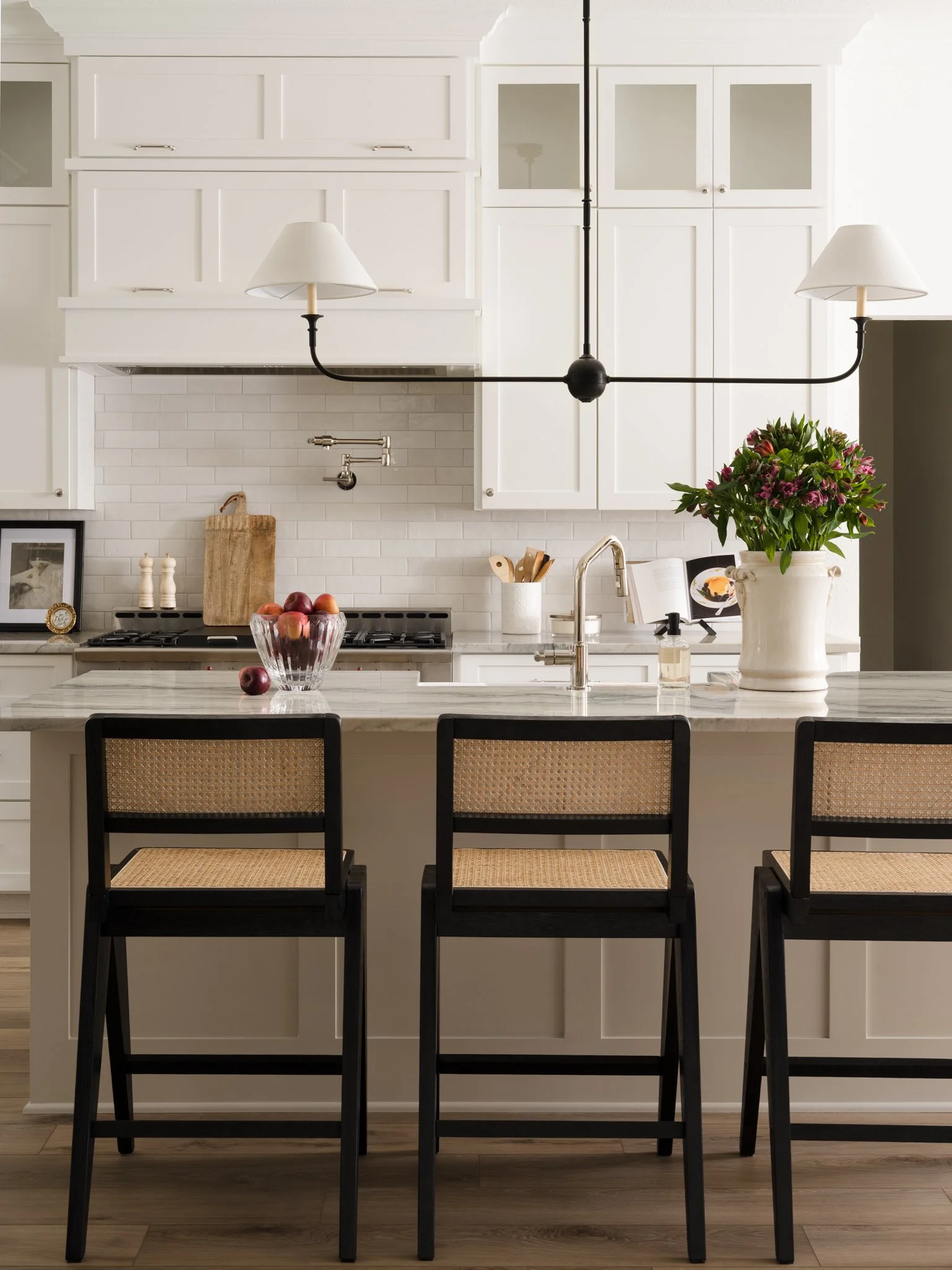
02 · WARM NEUTRAL
A versatile beige with soft gray undertones that shifts beautifully with its surroundings.
SHERWIN-WILLIAMS
ACCESSIBLE BEIGE · SW 7036
Sherwin-Williams Egret White
SW 7570
Egret White is another soft neutral I've encountered in designer projects, particularly on cabinetry. It sits in that interesting space between white, beige, and greige, which means its appearance can shift considerably depending on the materials and light surrounding it.
I've photographed it alongside warmer finishes where it reads soft and understated rather than stark, making it a beautiful backdrop for the layers of material, texture, and color happening elsewhere in the room.
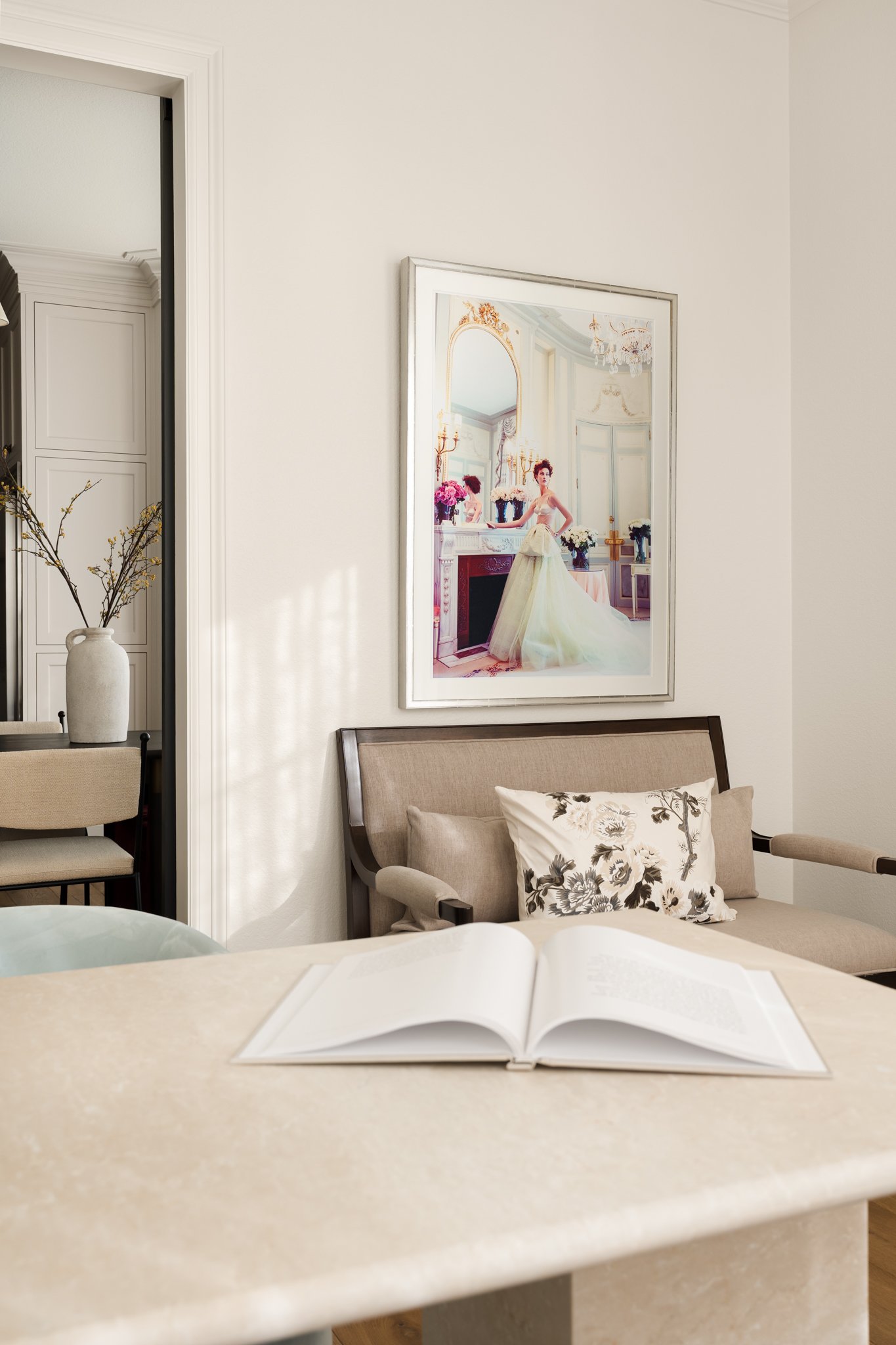
03 · WARM WHITE
A soft, nuanced neutral with just enough warmth to feel inviting while giving the surrounding materials and finishes room to stand out.
SHERWIN-WILLIAMS
EGRET WHITE · SW 7570
Sherwin-Williams Greek Villa
SW 7551
Greek Villa is another warm white I've encountered more than once, including on walls throughout main living spaces and in bathrooms.
And this is where photographing paint gets interesting. A color that sounds straightforward on paper can look remarkably different depending on the room it's in.
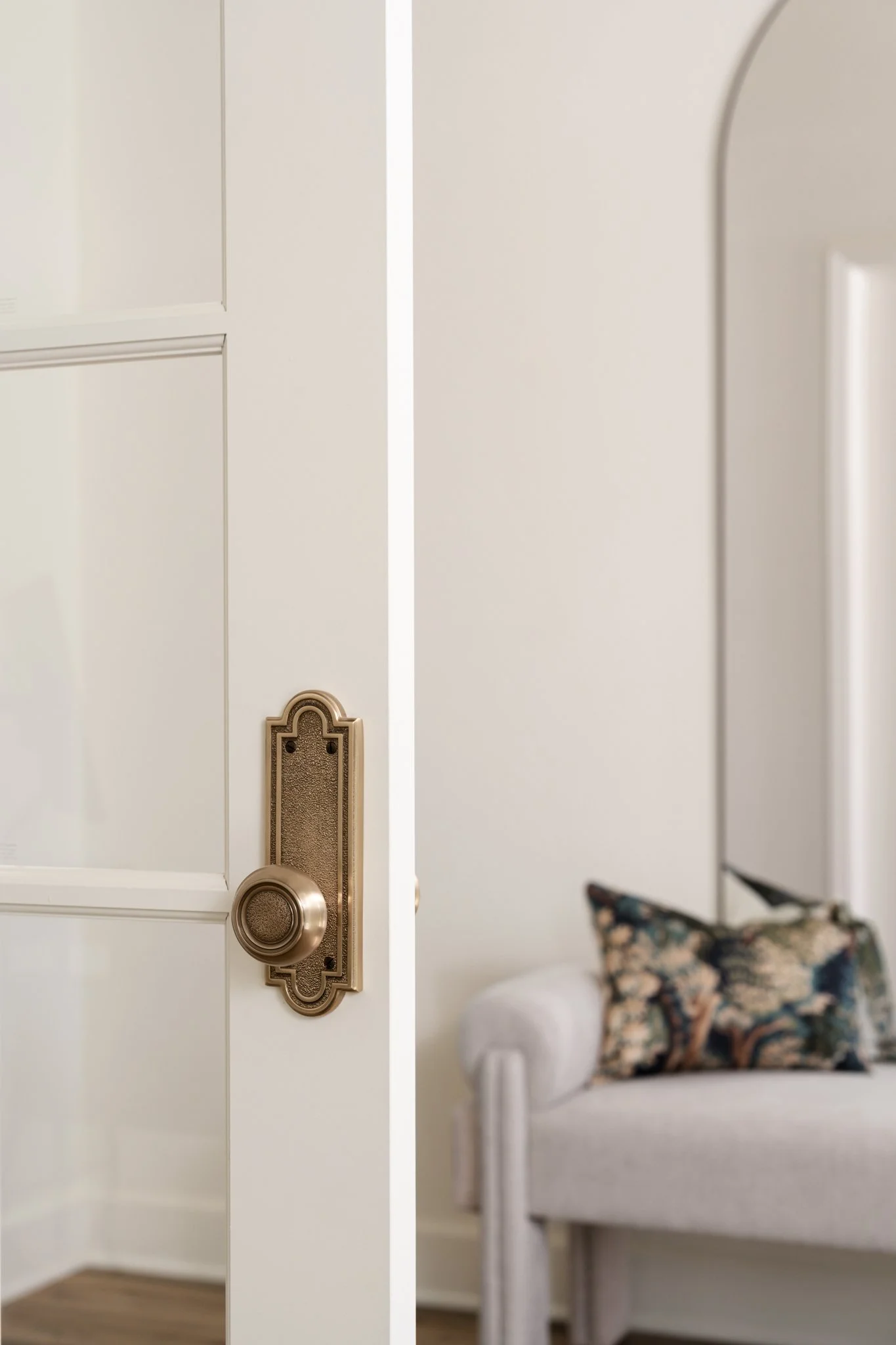
04 · WARM WHITE
A soft, nuanced neutral with just enough warmth to feel inviting while giving the surrounding materials and finishes room to stand out
SHERWIN-WILLIAMS
GREEK VILLA · SW 7551
Sherwin-Williams Anonymous
SW 7046
Anonymous is one of the deeper neutrals that has made more than one appearance in front of my camera.
I've photographed it on cabinetry as well as other applications, and it provides an interesting counterpoint to the warm whites and lighter neutrals that dominate many of the homes I photograph.
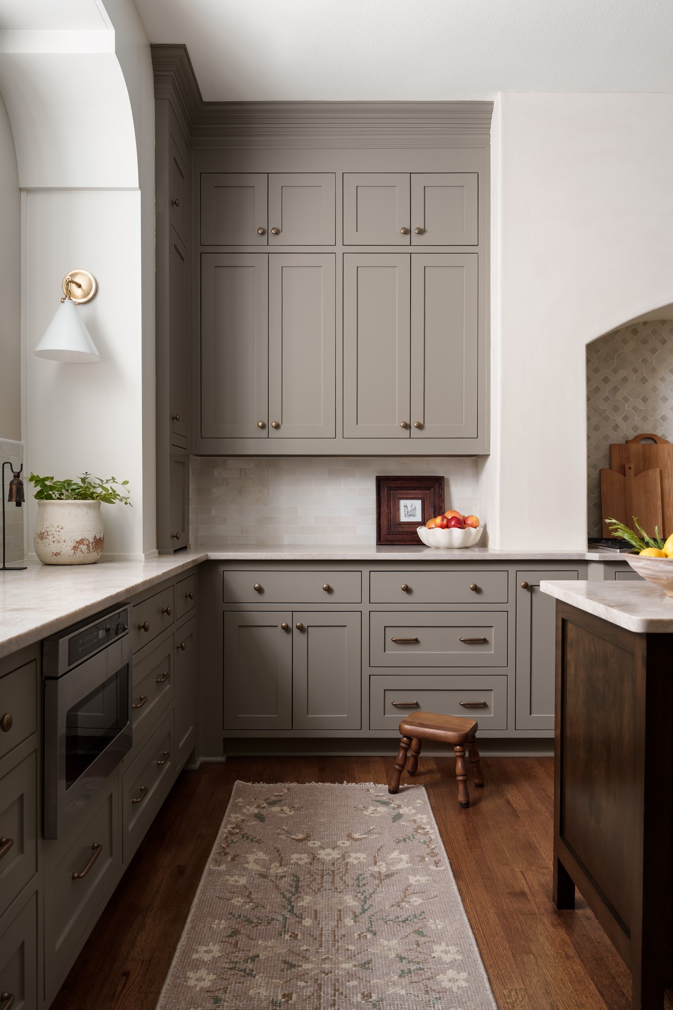
05 · DEEP NEUTRAL
A rich, earthy gray-brown with a grounded, sophisticated feel.
SHERWIN-WILLIAMS
ANONYMOUS · SW 7046
And Then Designers Have a Little More Fun
The recurring neutrals may be what first caught my attention, but some of my favorite colors in my project notes are the ones I've only photographed once.
I've seen Sherwin-Williams Stardew on wet bar cabinetry, Tempe Star in a mudroom, Iron Ore in a guest bathroom, Black Fox in a primary suite, and At Ease Soldier in a laundry room.
There have been rooms painted in Poised Taupe, Kilim Beige, Lunar Lite, Aesthetic White, Westhighland White, Whitetail, Tricorn Black, Worldly Gray, and Benjamin Moore Swiss Coffee.
Taken together, there's a pattern I love: the quieter colors often create the foundation of the home, while cabinetry, secondary rooms, and architectural details give designers an opportunity to do something a little more unexpected.
And, selfishly, those are often incredibly fun rooms to photograph.
Why Paint Color Is Surprisingly Complicated to Photograph
Here's something you might not think about when looking at an interior photograph: the color you're seeing isn't necessarily what the camera originally captured.
Light can wildly affect the appearance of paint.
The direction a room faces, the time of day, window light, surrounding materials, landscaping outside, and reflections from other surfaces can all introduce color into what should otherwise be a fairly neutral wall.
It's something I'm paying attention to throughout a photoshoot and again during post-production.
When a designer gives me the exact paint color used in a project, I can look up its RGB values and use them as a reference while I'm editing. If I know what the underlying color should be, it's much easier to recognize when environmental light has pushed the photographed wall too yellow, green, blue, or magenta.
That doesn't mean I'm making the wall perfectly match an RGB value.
In fact, I don't want to.
Paint changes with light in real life. That variation gives a room dimension and atmosphere, and eliminating it completely would make the photograph feel unnatural.
Instead, the RGB value gives me a reference point. I can preserve the way light actually moves through the room while making sure the finished photograph still represents the designer's color selection accurately.
For me, that's an important distinction.
My job isn't to reinterpret the designer's work in post-production. It's to photograph it in a way that remains true to what they created.
The Same Paint Color Is Never Really the Same
One of the advantages of seeing the same paint colors across completely different projects is realizing just how much the rest of the design matters.
Put a warm white beside white oak, natural stone, and linen and it may feel soft and organic. Put that same color beside richly veined marble, dark cabinetry, colorful textiles, or polished metal and it can take on an entirely different character.
That's something a paint chip can never fully communicate.
Paint exists in relationship with everything around it: the architecture, materials, furnishings, art, window orientation, and light.
So while these are colors I've watched talented interior designers return to, I wouldn't treat this as a list of colors you should automatically paint your own home.
Consider it a peek inside the project notes of an interior photographer and a little inspiration from the beautifully designed spaces that have found their way in front of my camera.
Because after photographing all of them, one thing is very clear:
There isn't one perfect white, beige, taupe, blue, or black.
There is the color that's right for the room.
Follow Along on Instagram
Recent projects, behind-the-scenes moments, and a closer look at the spaces, details, and designers I have the opportunity to photograph.
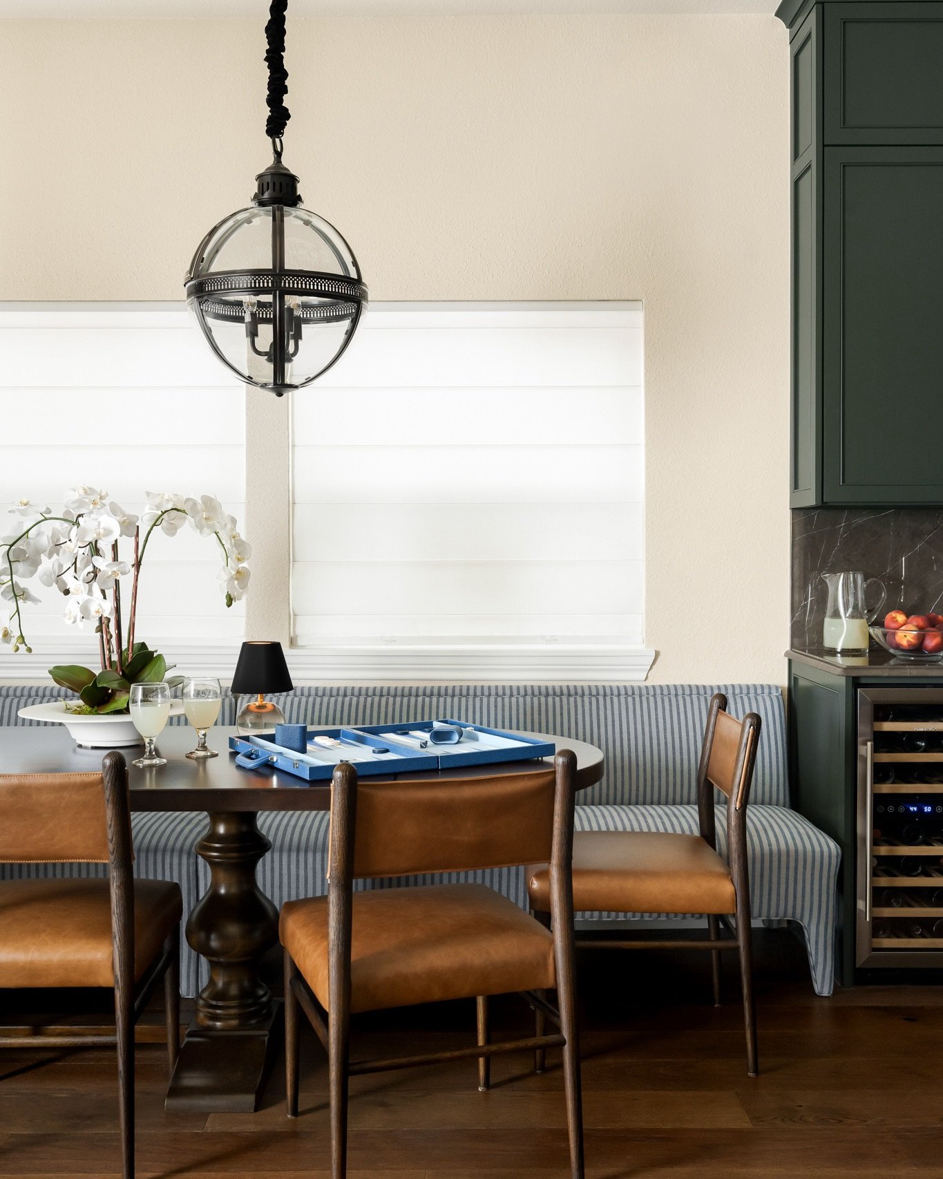
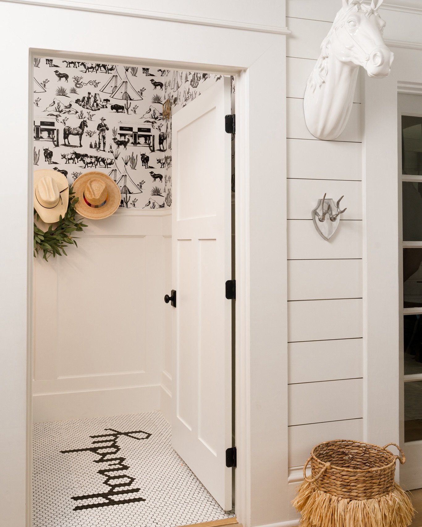
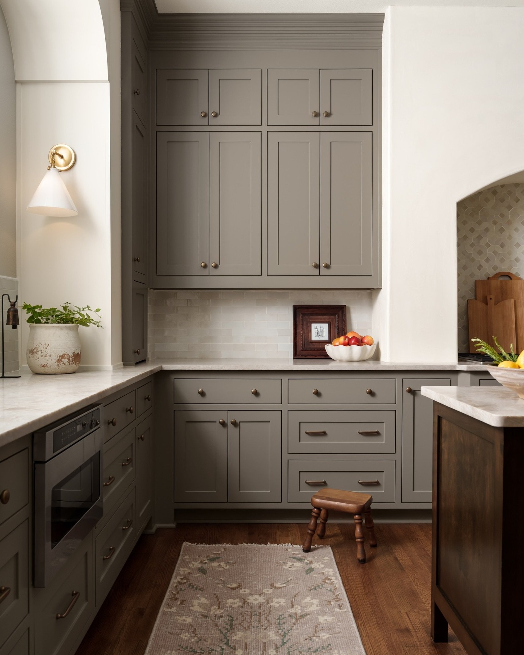
Your design decisions deserve to be photographed with the same intention that went into making them.
From the exact shade of paint on the walls to the materials, finishes, and details that bring a room together, thoughtful interior photography preserves the choices that make your work distinctly yours.
If you have a completed project ready to be documented, I’d love to hear about it.